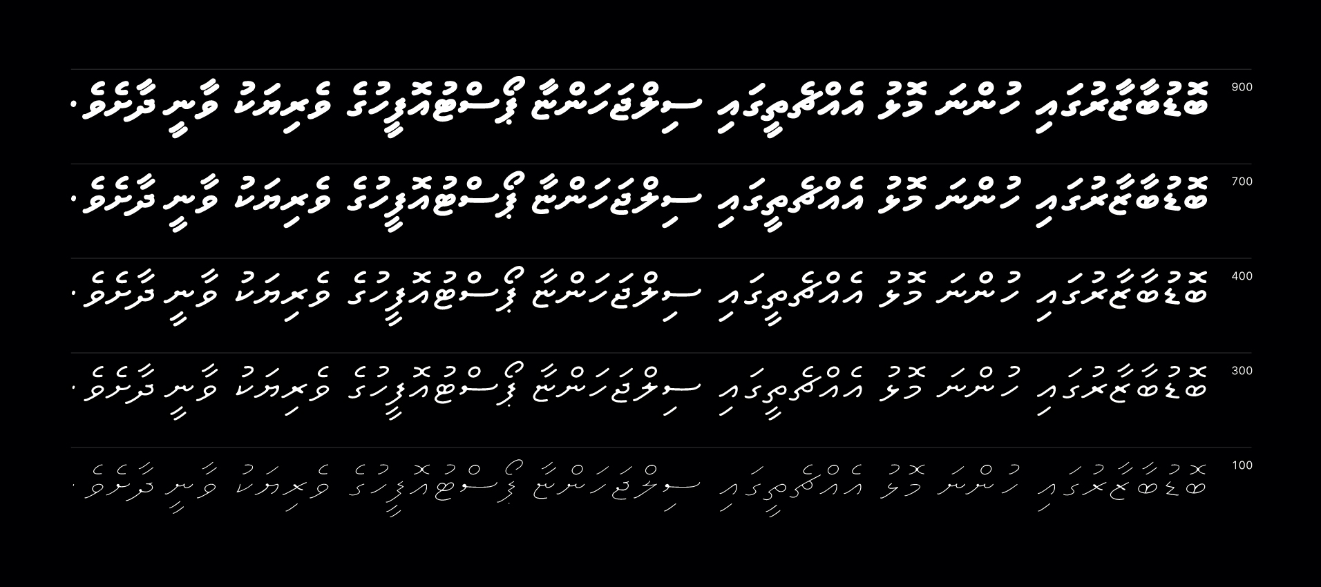
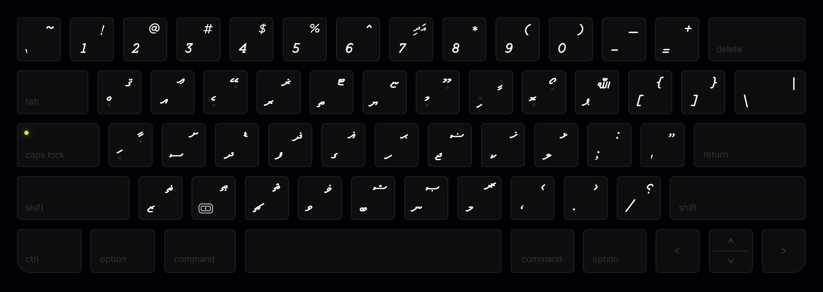
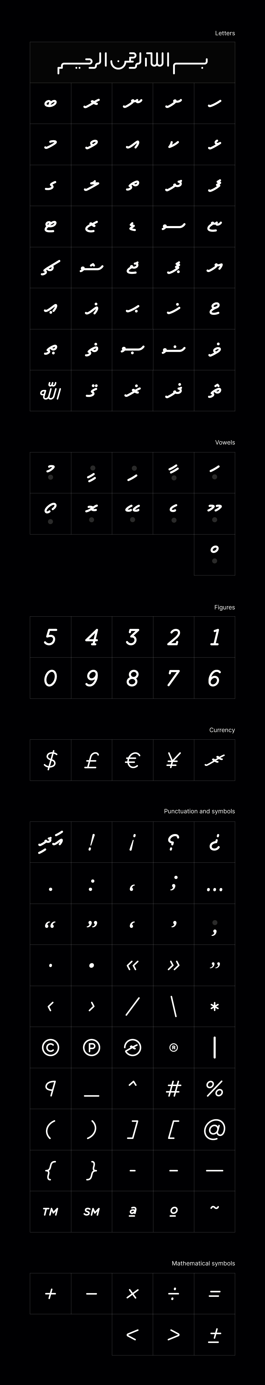
Akuru Thaana typography

Industry

Central Bank

Year

2020

Collaboraters

Illustration - John Doe

Deliverables

Packaging Design

Branding System

Photography

Art Direction

'Akuru' is a custom typeface designed exclusively for the new bank notes of Maldives.The typeface was designed to prioritize legibility and readability, resulting in clean and sharp text. With meticulous attention to detail and custom kerning adjustments, 'Akuru' ensures that even the smallest text is sharp and easily readable.

Akuru Glyphs

We commissioned a bespoke typeface that reflects the avant garde principles behind the brand.

Influenced by modernist typography and native browser styling, we worked with FrosType to create FT Basic Space - a grotesque type family composed of 14 styles and letter forms that are specially designed for digital displays.